
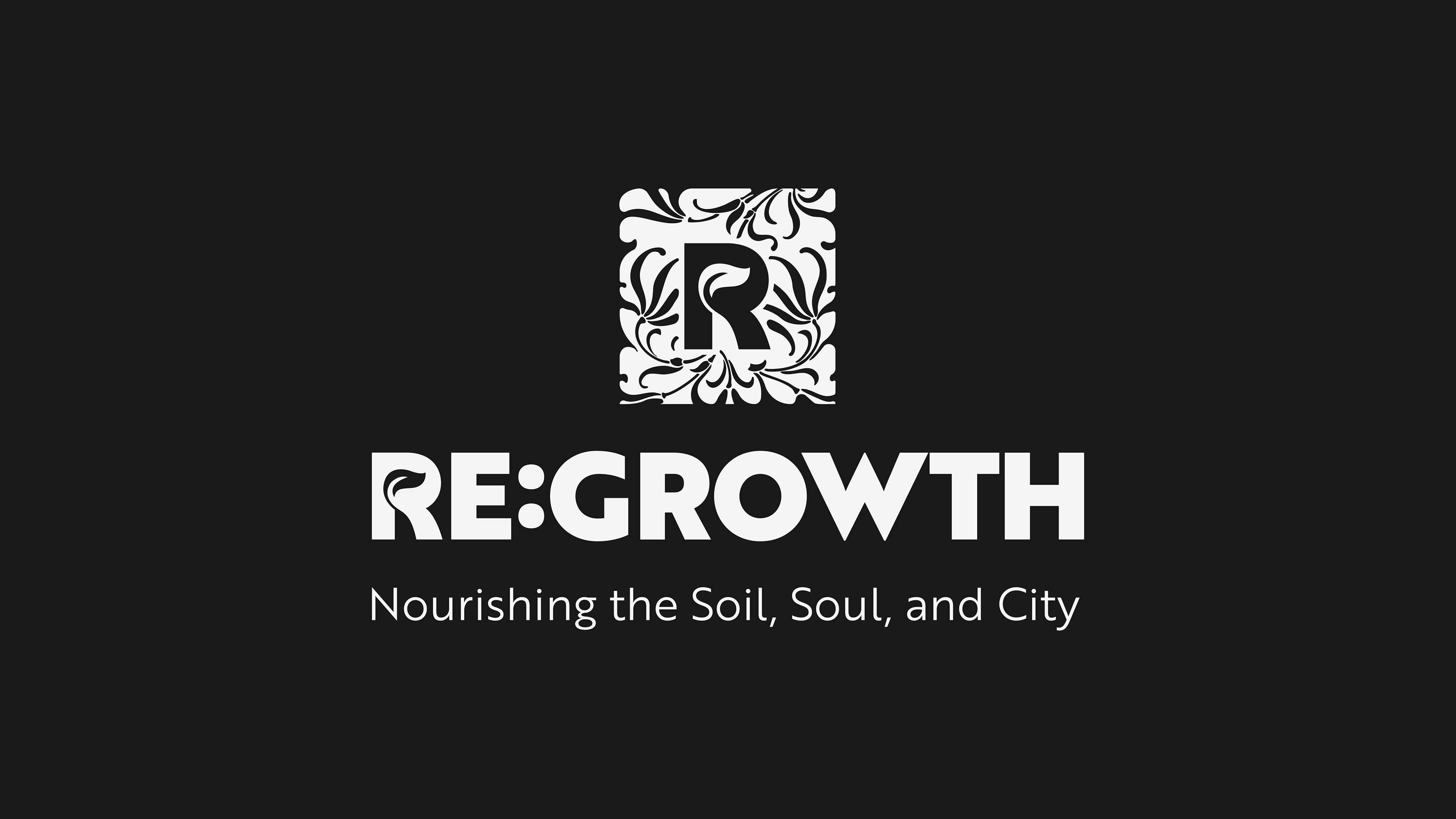
The design philosophy for the RE:GROWTH monogram is fundamentally rooted in the principles established by William Morris. This connection provides the logo with a rich, counter-modernist context that perfectly aligns with the brand's mission of holistic regeneration.
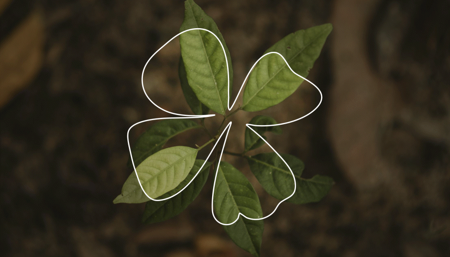
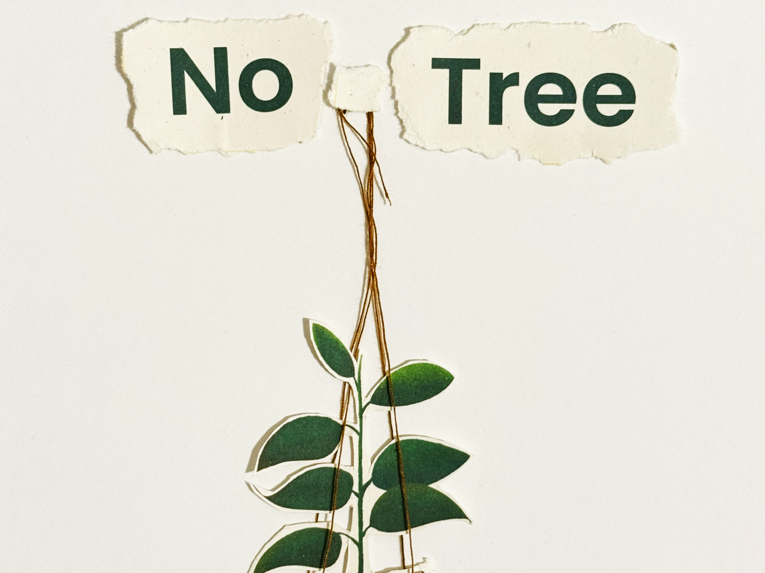
This motif inherently symbolizes regrowth and upward momentum, directly addressing the "RE:GROWTH" name.

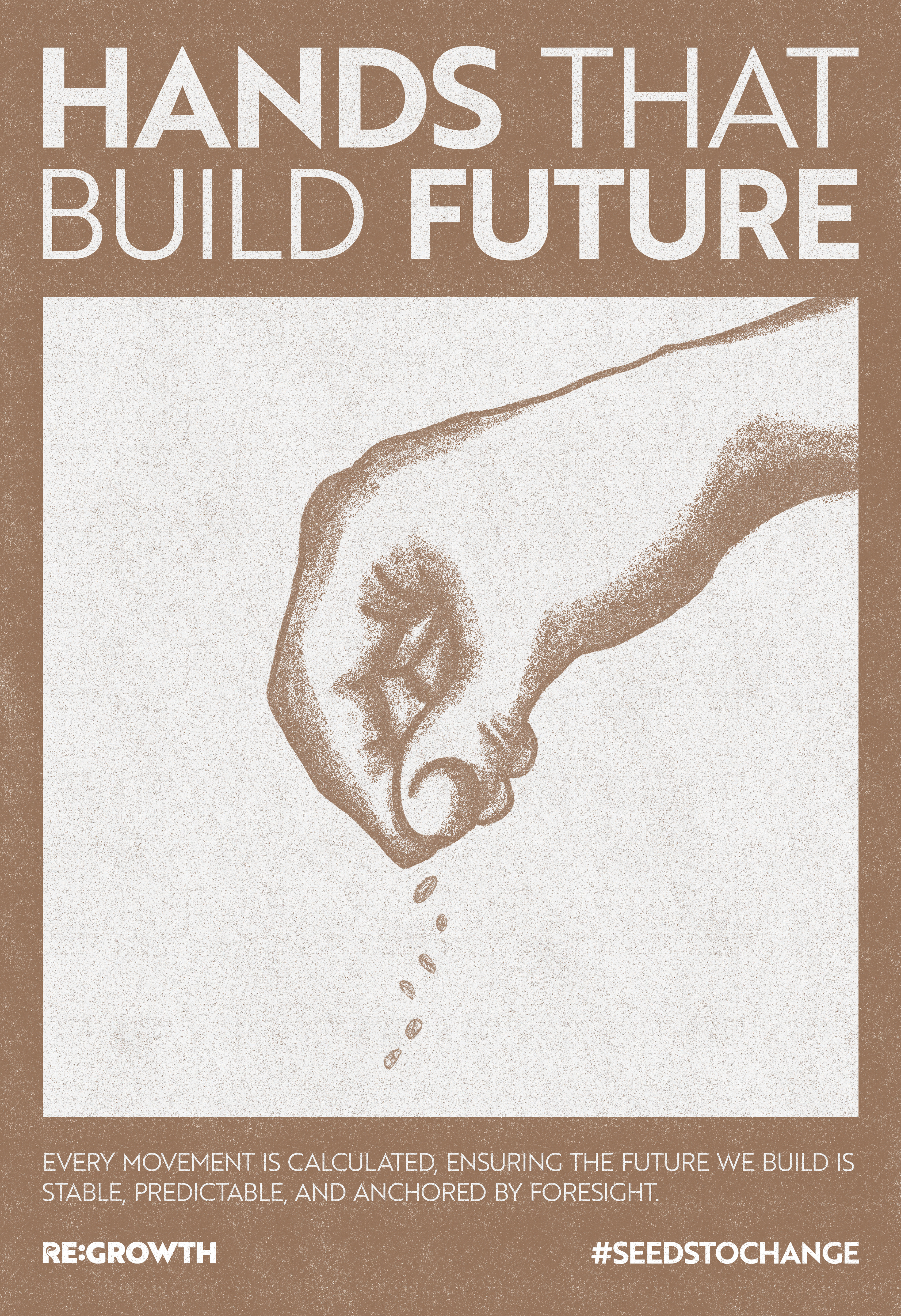
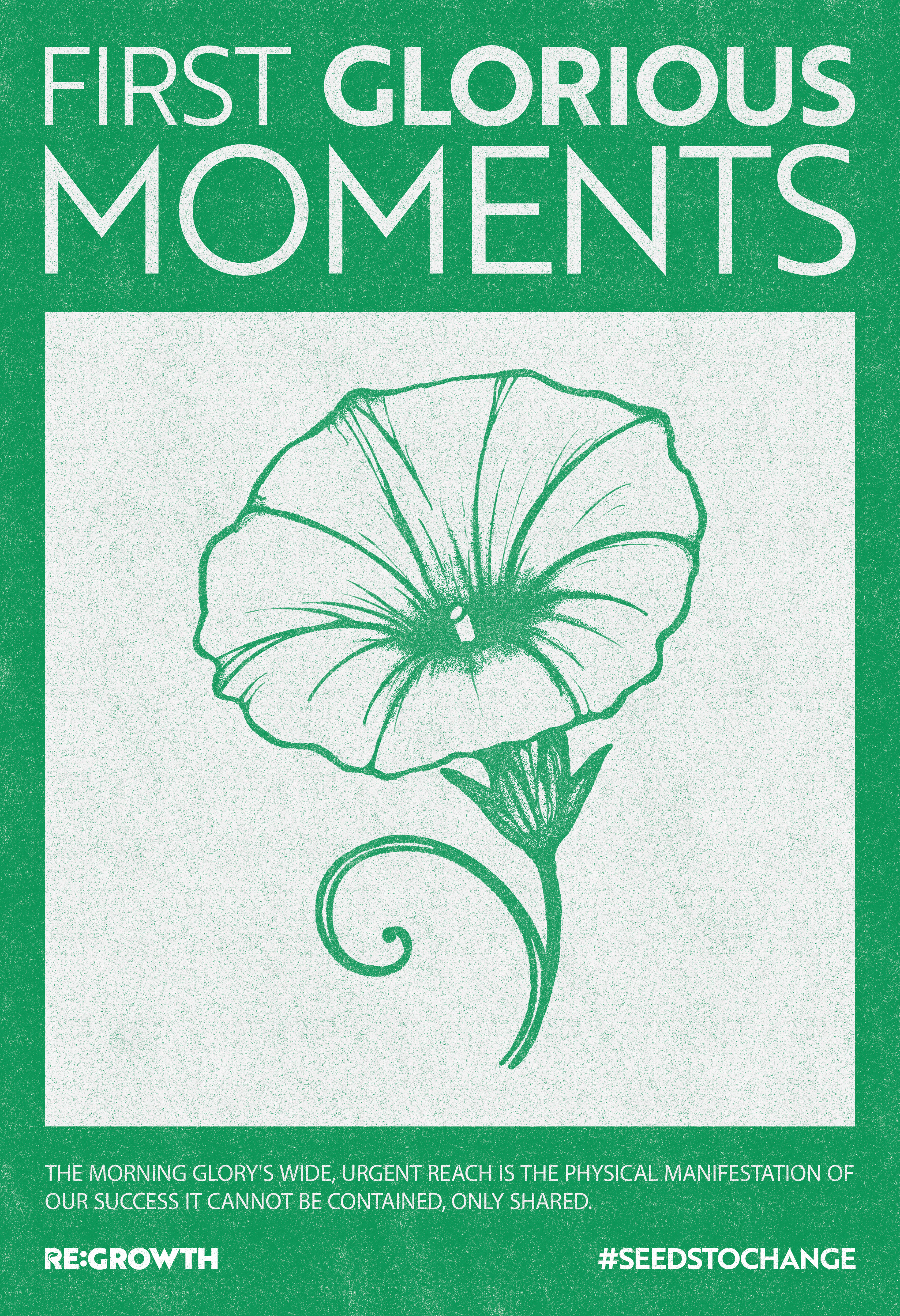
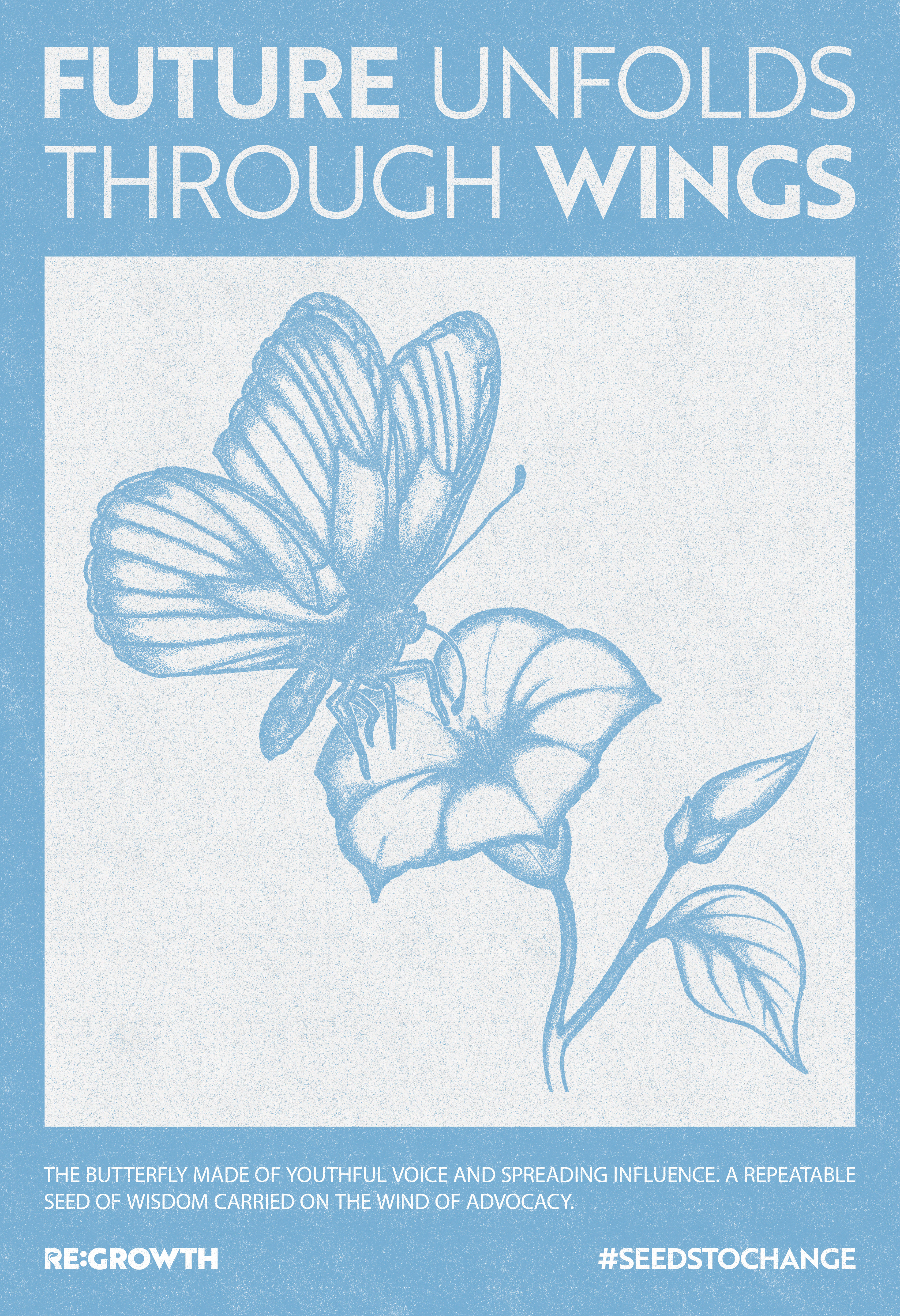
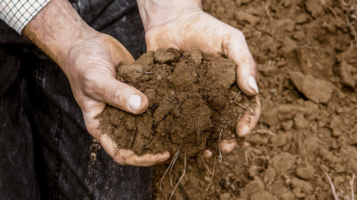
nurturing potential—in the soil, in the air, and in people.

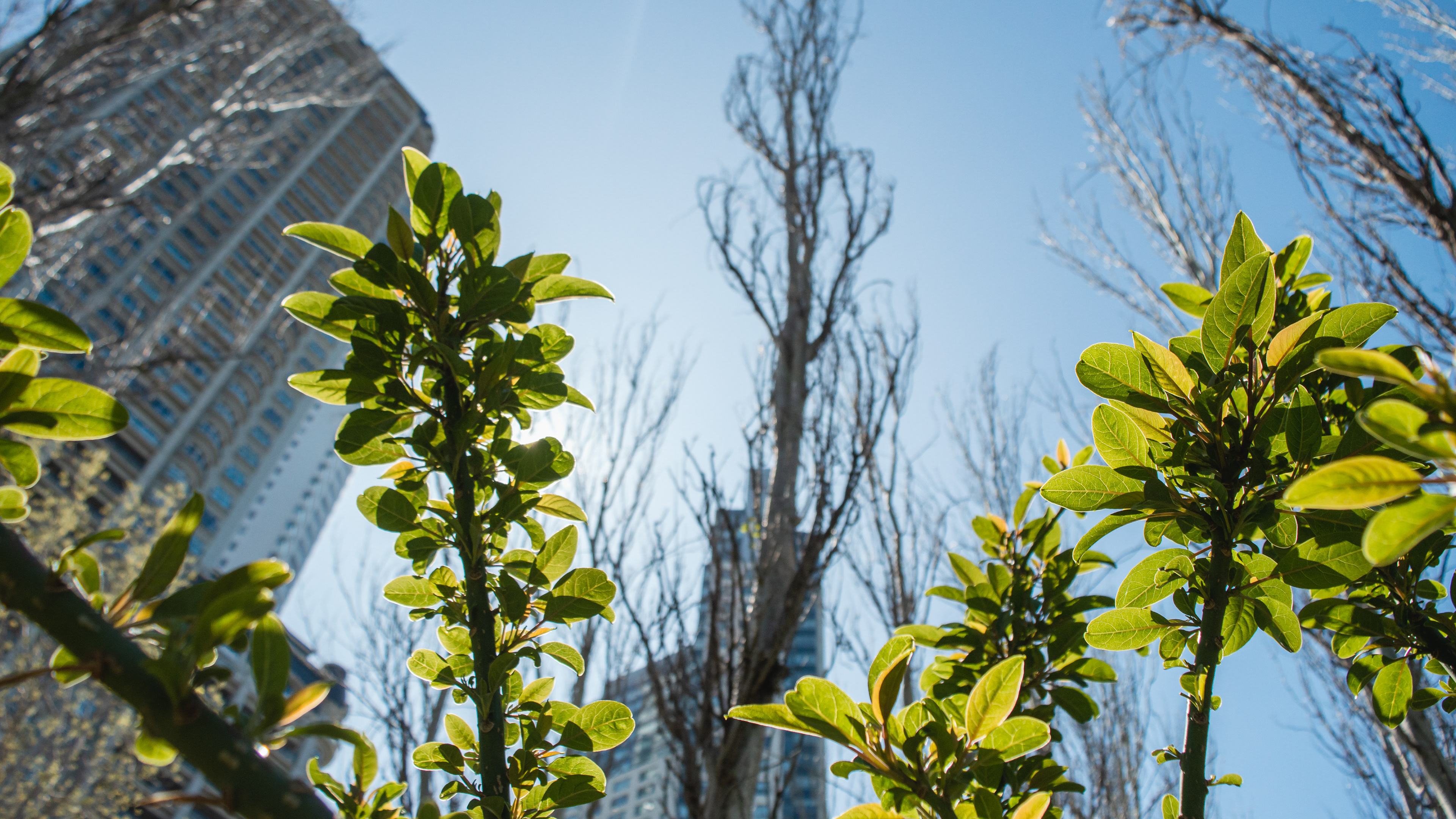
A study by Wayne C. Zipperer says, “At the beginning of the 21st century, more than 50% of the world’s population lived in cities. By 2050, this percentage will exceed 60%.” Rapid urbanization and the expansion of human footprints cause serious ecological damage in urban areas and biodiversity loss.

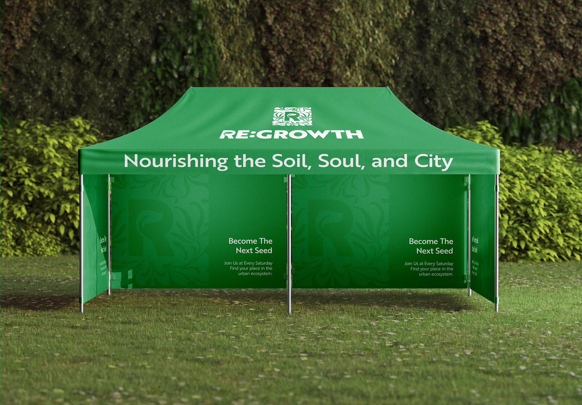
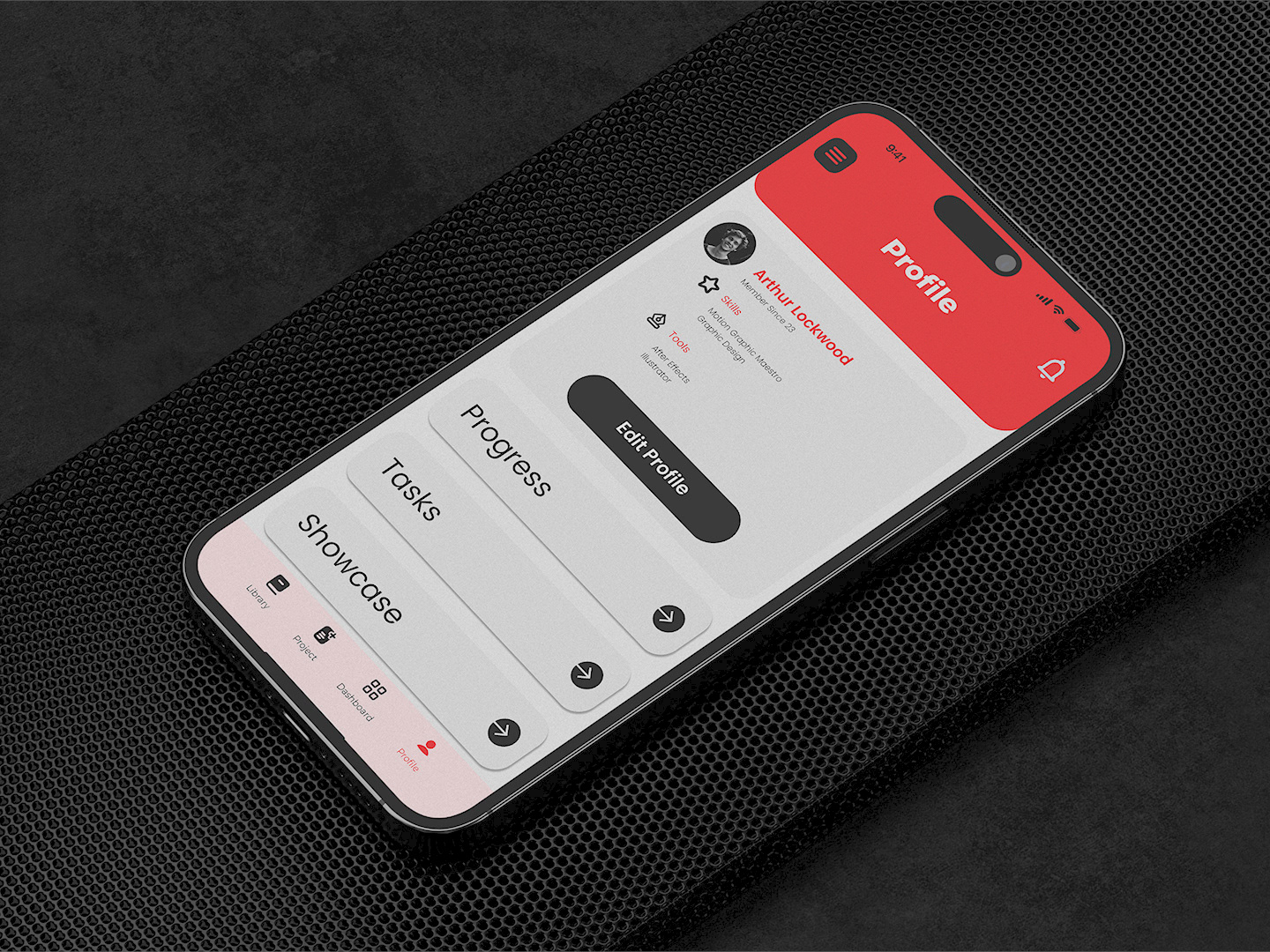
Multiple identity lockups were developed for the brand.
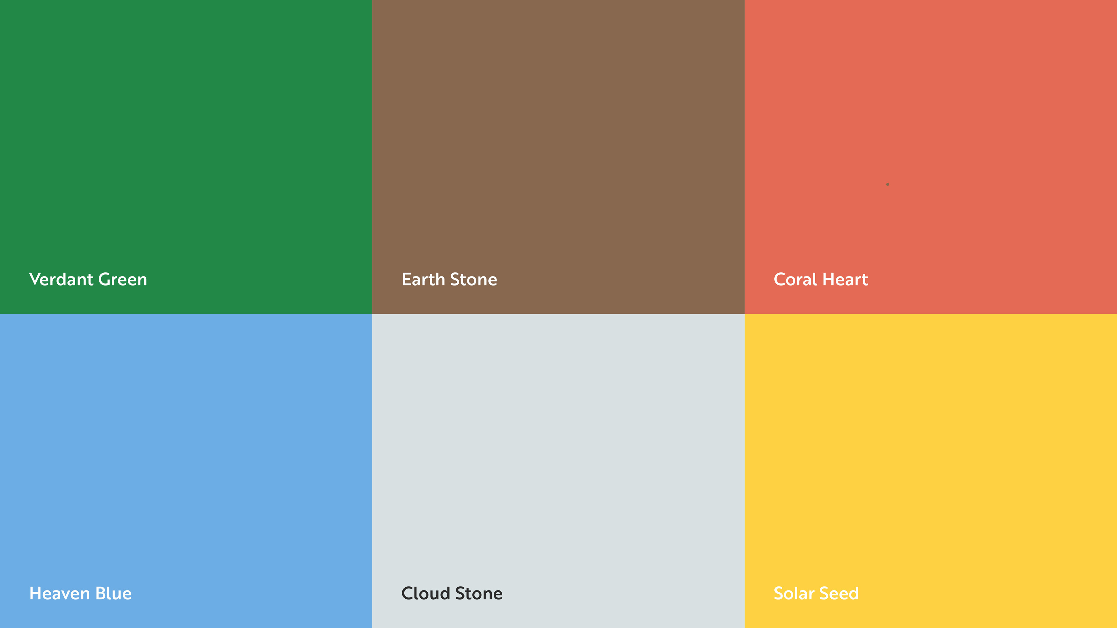
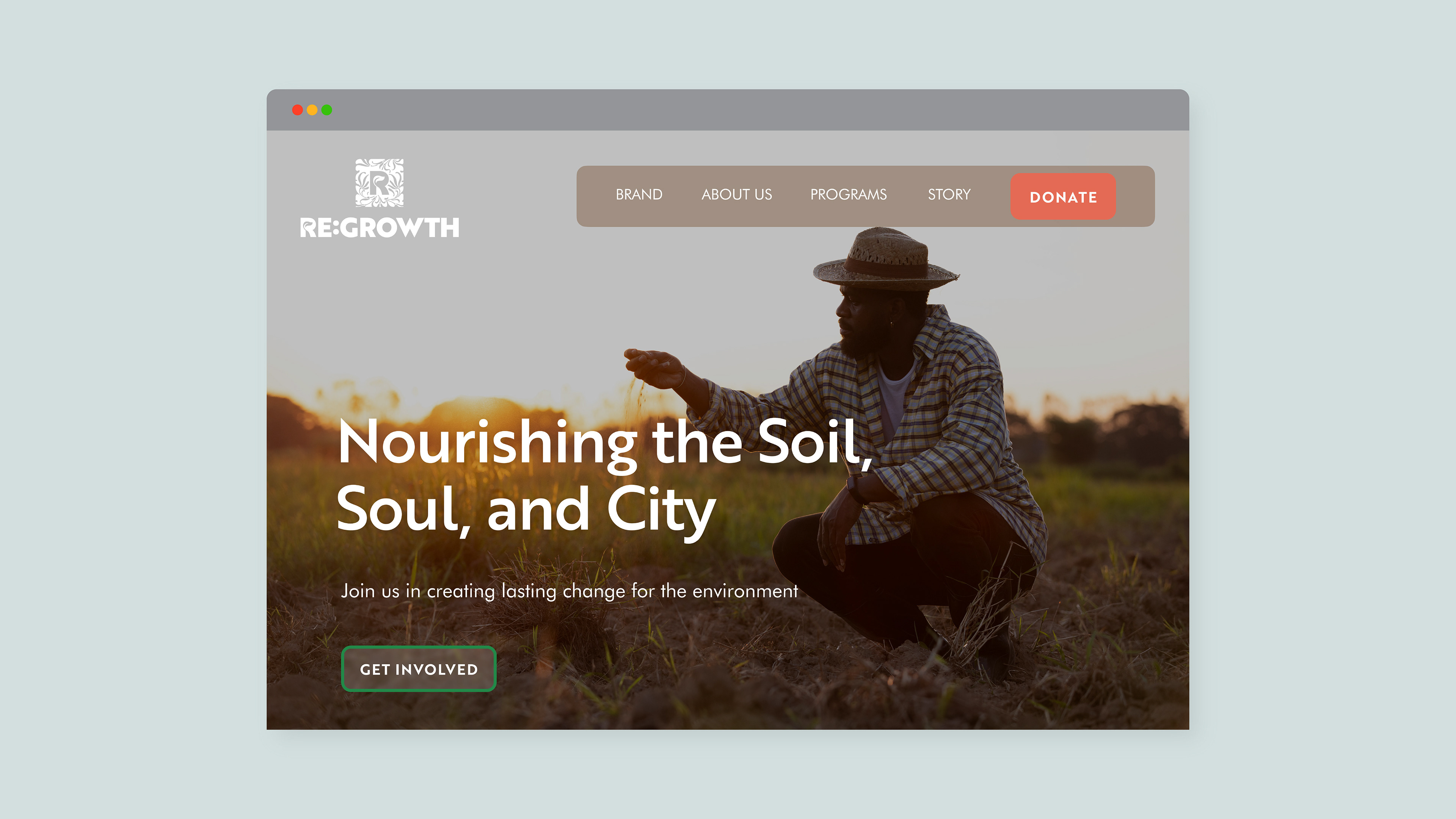
Our palette is the visual backbone of our story, strategically designed to bridge the rational and the organic. They balance the grounded stability of the soil with the vibrant optimism of new growth and strategic foresight.
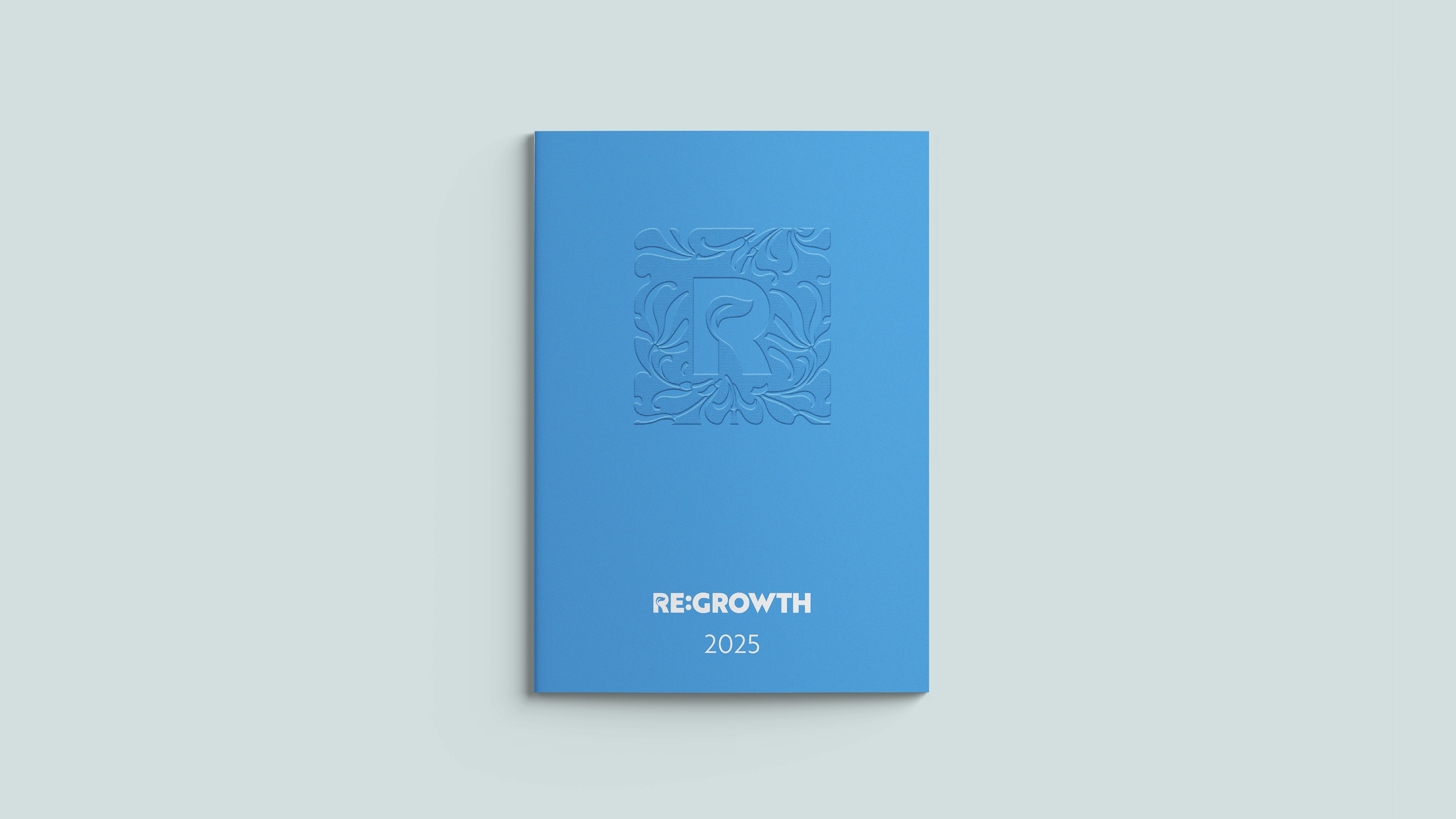
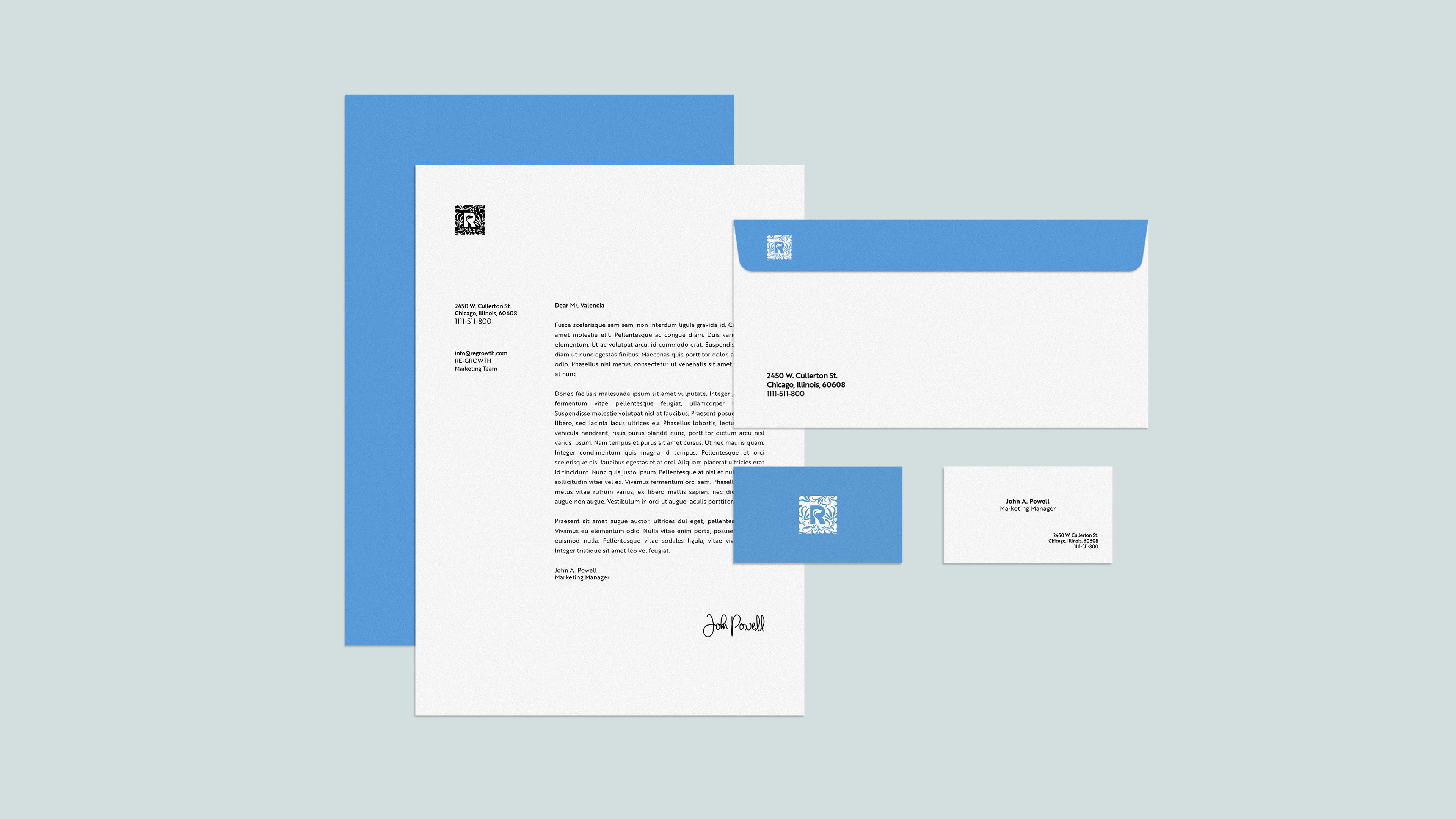
Business materials emphasize the color Heaven Blue, It focuses on clarity and intelligence, reflecting the city component of our mission.

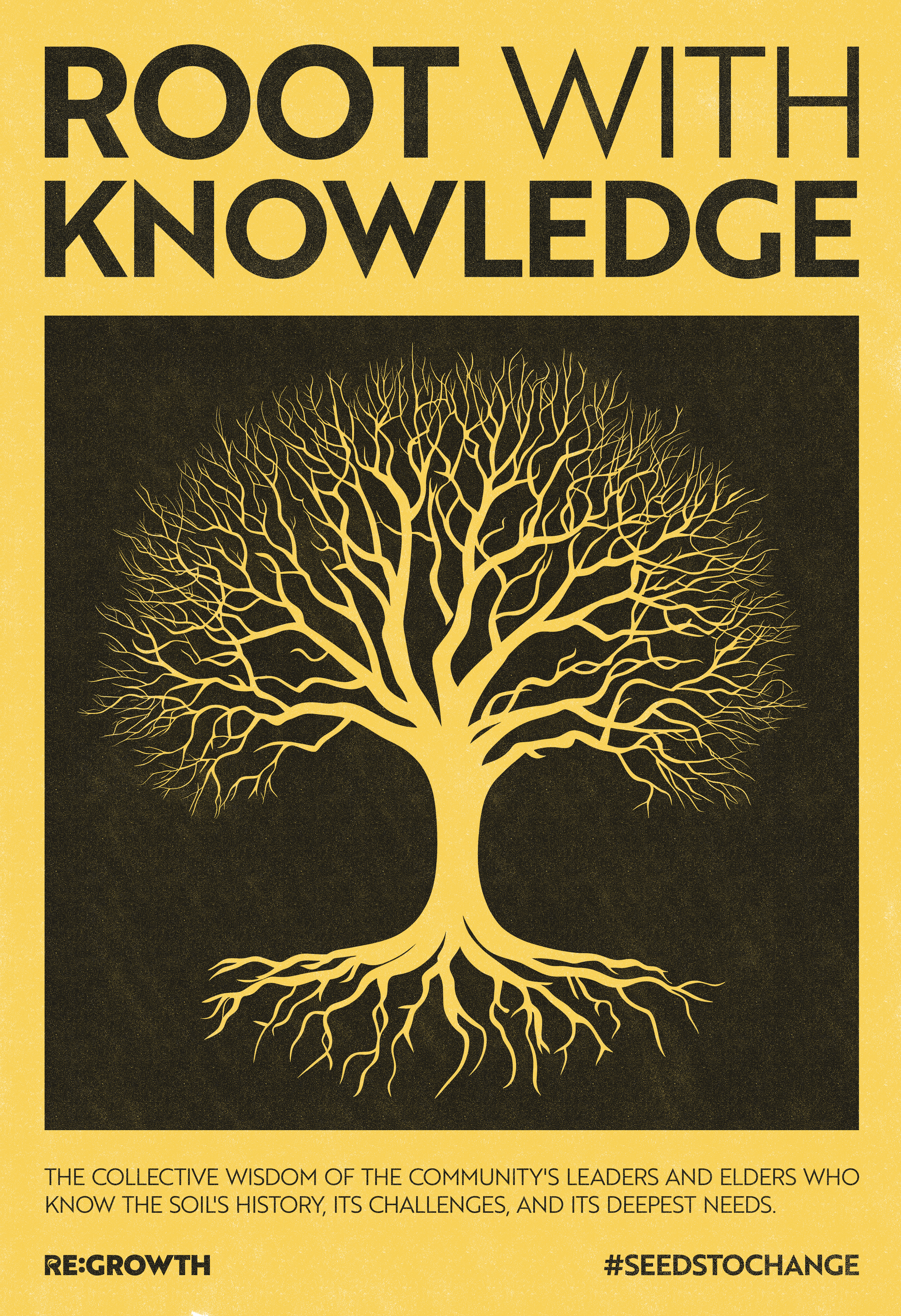
Real change is shared change. Collective knowledge, resources, and effort lead the community to rebuild social trust and bonds to overcome social decay.
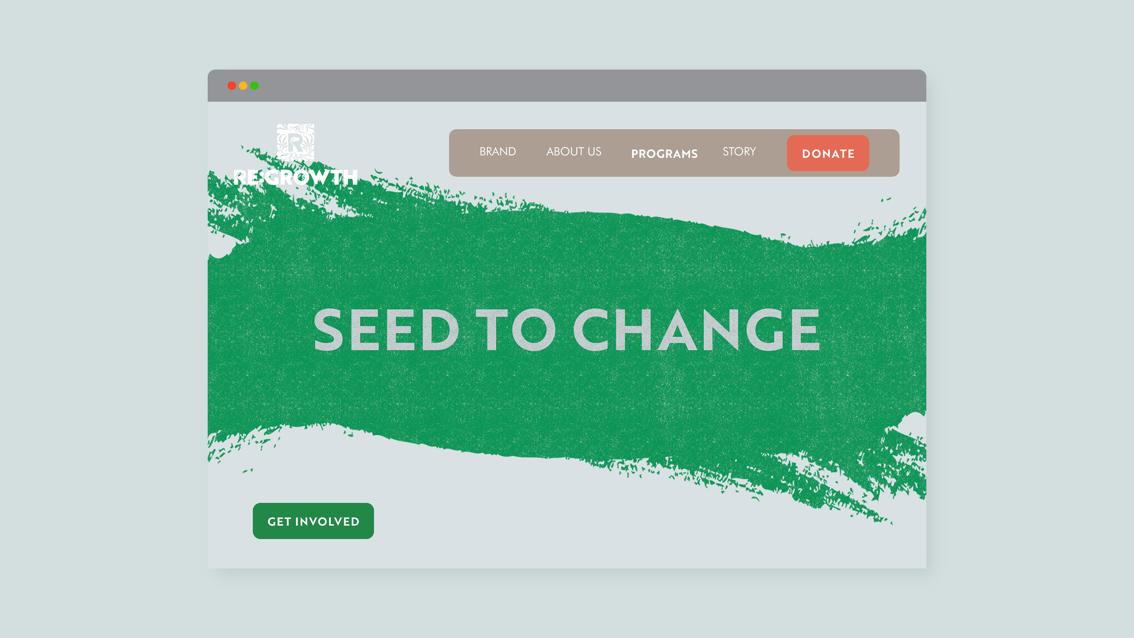
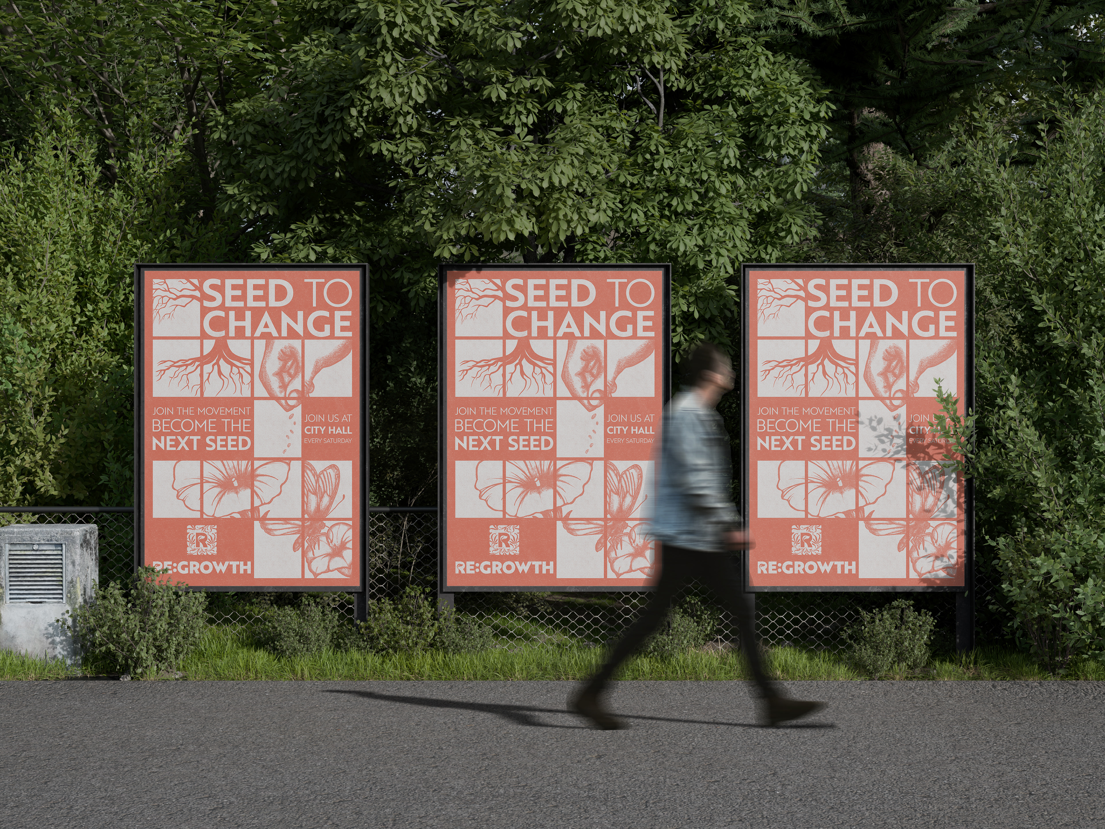
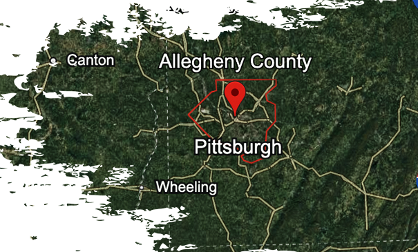
Seed To Change is a program we designed for the city of Pittsburgh. We're transforming contaminated vacant lots into vibrant, safe, community food sources.
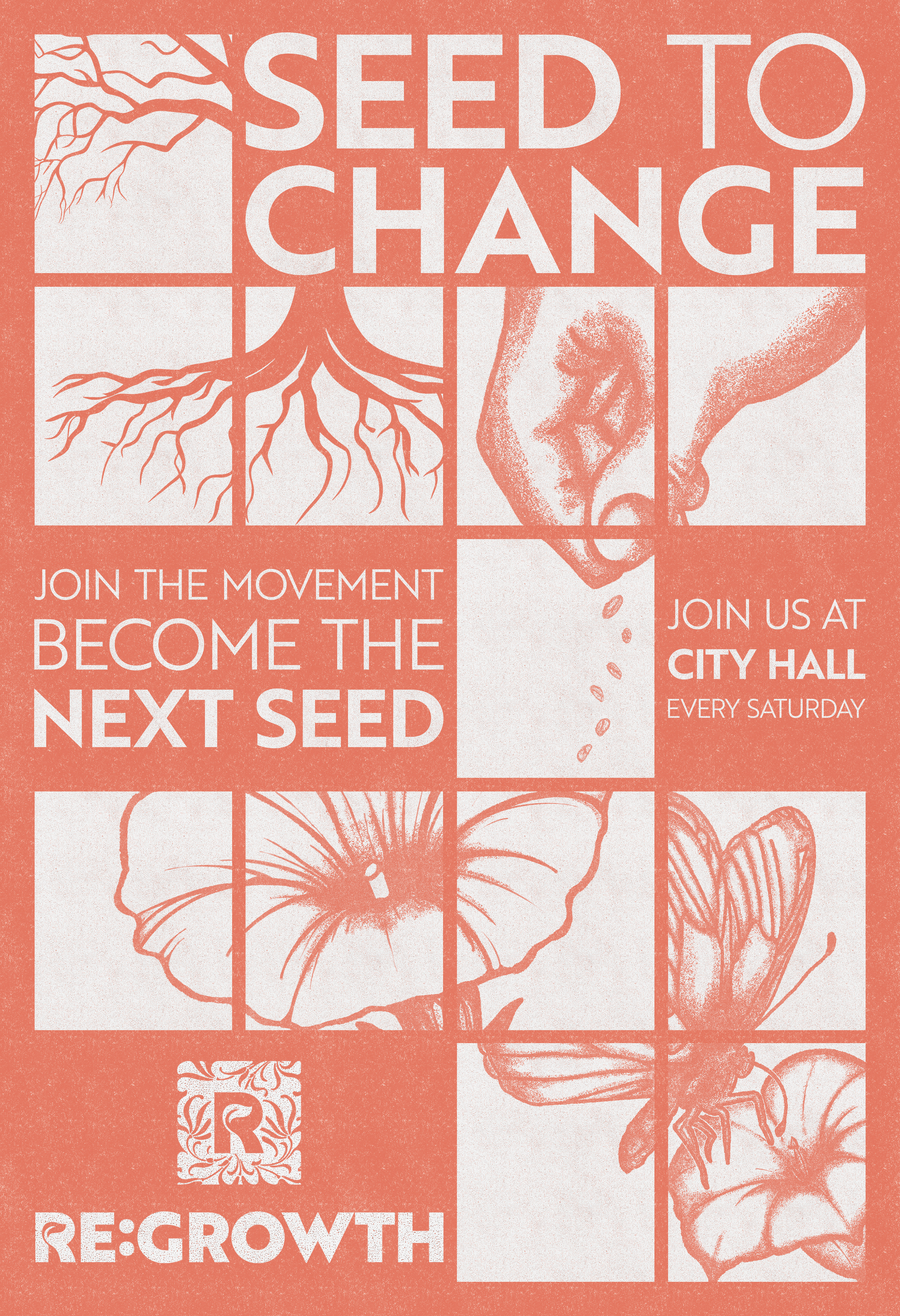
An "Activations" Poster—By using a limited, two-tone palette, the texture becomes the secondary "color." It creates a middle ground of tonal depth without needing to add extra hues, maintaining a clean yet gritty industrial look.