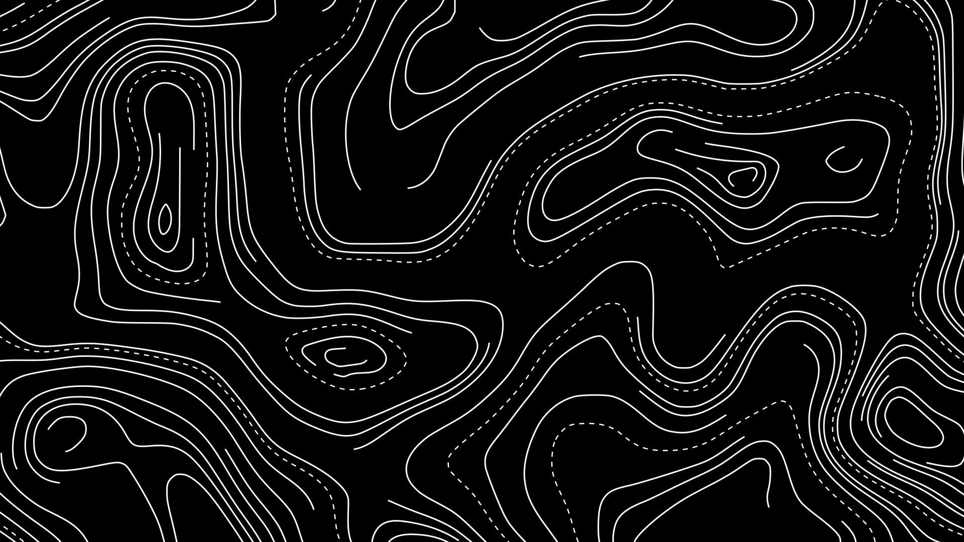
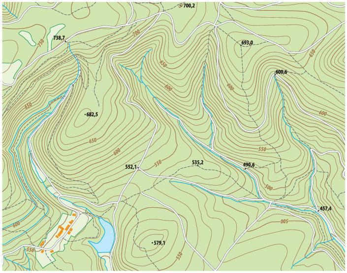
Primary visual language is animated topographic line patterns inspired by the Pinhoti Trail maps, translating terrain data into a dynamic graphic system that reflects movement, elevation, and the experiential nature of trail exploration.
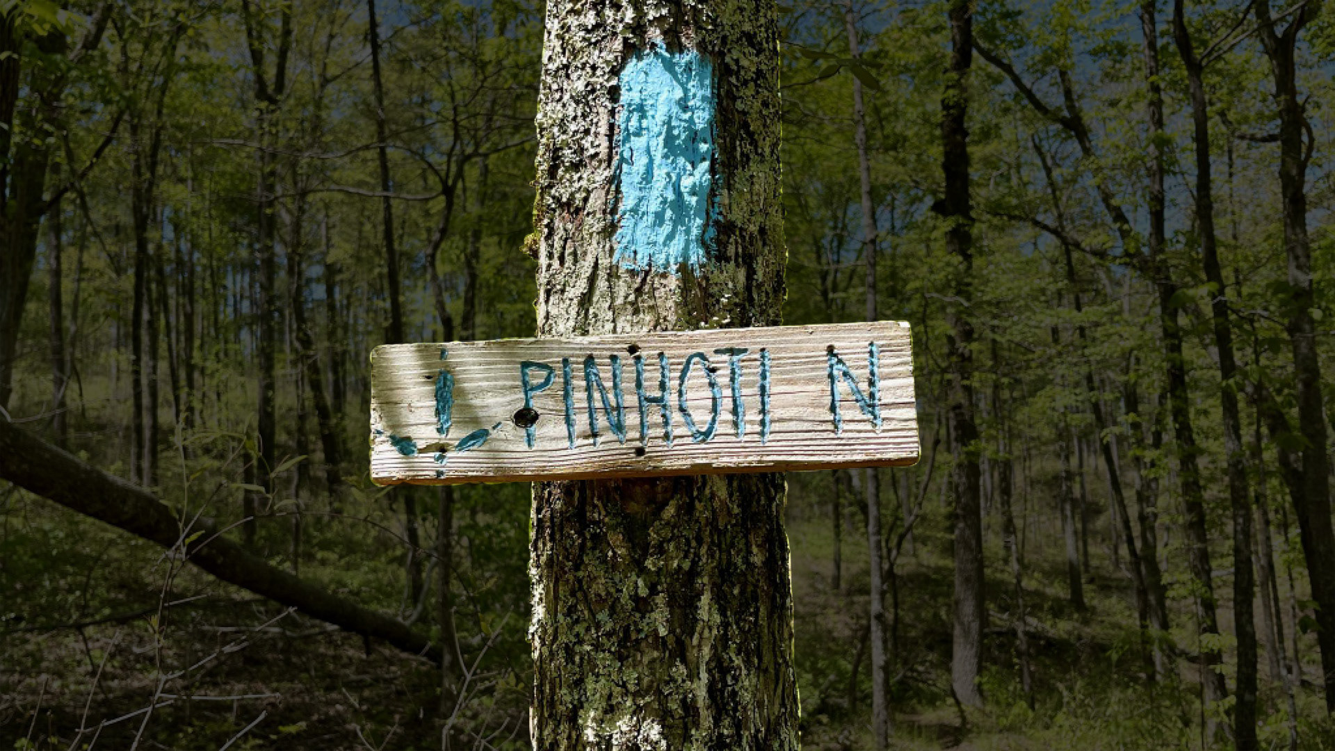
The color palette is derived from Pinhoti Trail blaze markers—featuring a distinct, weathered blue used for navigation in natural landscapes. This hue is translated into the visual system to evoke authenticity, guidance, and connection to the trail experience.

Lower thirds are designed as clean, geometric overlays using the Pinhoti-inspired blue, integrating subtle topographic textures to maintain visual consistency. The angled form introduces a sense of direction and movement, reinforcing the trail narrative while ensuring clear hierarchy and legibility of speaker information.

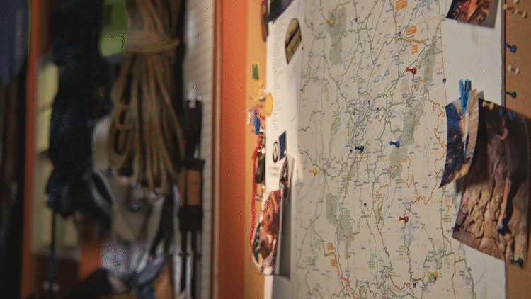
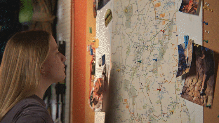
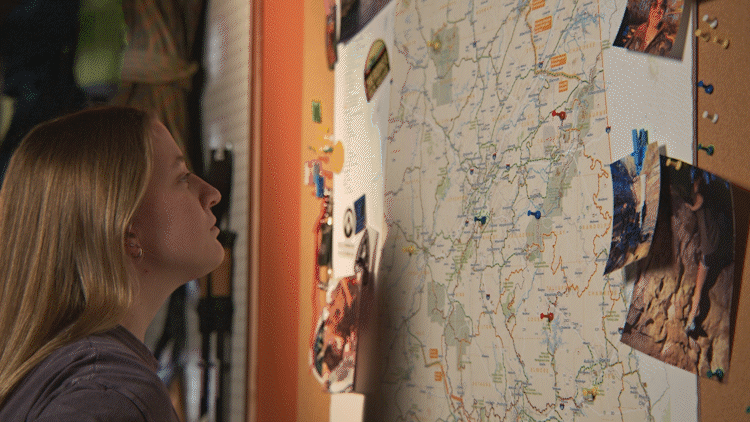
Directional map callouts using Pinhoti blue—designed to highlight locations while reinforcing navigation
and movement.
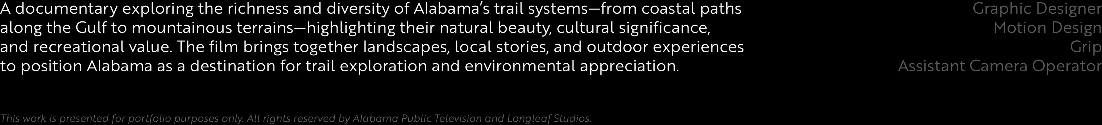
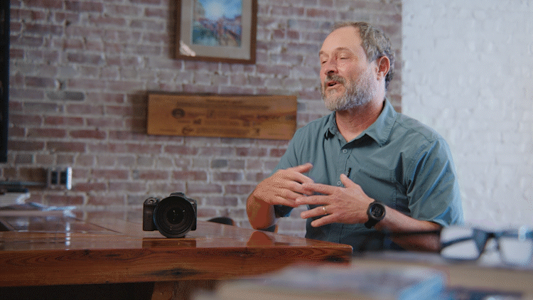
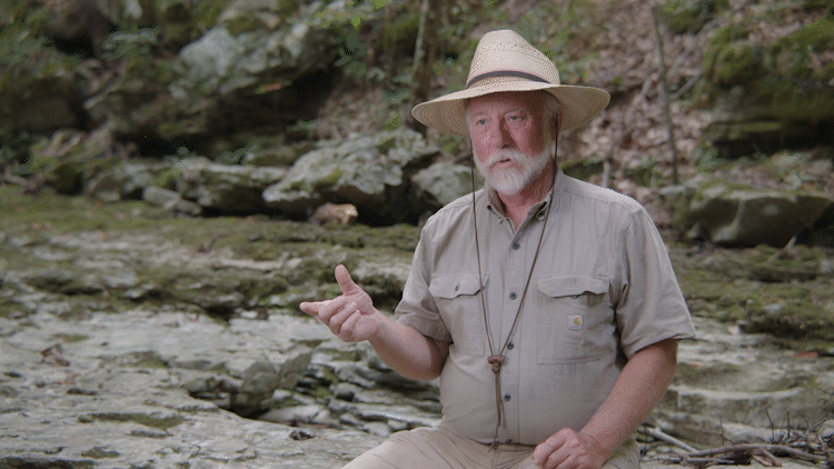
Camera Works